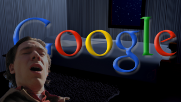
Op-Ed: I Feel Like the Google Logo Gives Good Head

One word. Six letters. You probably glance at them every single day before you look up whatever depraved topic is on your mind—but do you really SEE them??
I do. I see them. I see the greatness of the Google logo, and its potential for continued greatness, specifically in the line of work that is oral pleasure.
Firstly, listen to the name itself. Google. Such a pleasant repetition of sounds in a unique combination. It’s a treat to roll the name on your tongue, one that will certainly taste even better when you’re screaming it out loud in pleasure.
Secondly, consider its shape. Everyone is beautiful in their own way—but the pure allure of the first four letters of the Google logo cannot be denied. Its curvaceous figure is one that would satisfy nearly anyone on this planet. And if for some reason you are not attracted to the voluptuous, there are the more manageable “l” and “e,” standing tall and firm for those who need something simpler. The combination of letters both soft and hard will surely get you the results you’re searching for, and you won’t even need to go to page 2.
Finally, its mindset. Over the years, the Google logo has changed slightly in font and color, yet never too drastically. When it goes down on you, it will do the same: adapting to your preferences while simultaneously creating a space for both of you to be yourselves. In such an intimate act, what more could you ask for? I can hear the criticism. You say, “Caitlin, this opinion is completely skewed by the fact that you are single and desperate.” I do not deny these allegations. They are, in fact, true. But I argue that they are what makes me the most qualified. I could have picked anyone, anything, to praise for their oral potential, but I chose this one. Google has the “I’m feeling lucky” button for a reason.

